


Just on two years back I wrote a post about a particularly interesting album by David Bowie entitled Station To Station. That blog post attracts more comments than most on this blog.
The album was released in 1976. The album is excellent in its own right and marks Bowie’s transition from his US influenced ‘plastic soul’ period of Young Americans through to the experimentation of the Berlin influenced trilogy of Low, “Heroes” and Lodger. Bowie collaborated with Brian Eno on those albums.
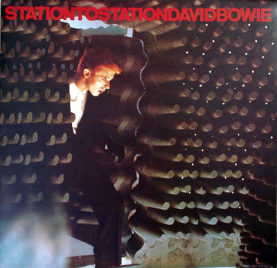
My original post sets out the variations in the artwork that were planned for and finally graced the Station To Station album sleeve. The original artwork incorporated a full colour photograph of Bowie taken on the set of the film, The Man Who Fell To Earth. This artwork, apparently, was not favoured by Bowie and a cropped black and white incarnation of the photograph was utilised instead. That album sleeve is shown below. Some of you may own a copy.

Many fans were oblivious to the existence of the full colour artwork until a copy was published in David Bowie: An Illustrated Record by Roy Carr and Charles Shaar Murray. The full colour artwork was an impressive revelation at the time and many wondered why the decision was made to go with the cropped black and white photograph.
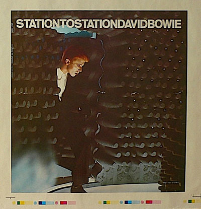
Full colour printer proofs were produced by RCA in the USA in 1975. Michael Olsen, who was working for Bowie’s record company in 1975 obtained copies of the printer proofs amongst a collection of materials that the company felt was no longer needed. Michael himself commented about this on my earlier post. In addition to the RCA full colour proofs printed in the USA a number of 24″ X 12″ full colour flat mock-ups of the sleeve were produced by RCA in the UK and these were used by sales representatives to market the forthcoming album. One of these RCA UK mock-ups is illustrated below. Promotional posters printed at the time featured the full colour artwork as well.

During the late 1980s one of the full colour RCA proofs was sold or passed to a collector in the UK and it was utilised to produce a counterfeit of the full colour artwork. One could pick up a copy of the counterfeit sleeve for £10.00. As I commented on my original blog post the counterfeits were excellent and nicely reproduce the RCA USA colour proof. They were folded and glued and they were ubiquitous amongst Bowie fans from that time. Some collectors bought half a dozen or more. It was a genuine bargain. One of these counterfeits is illustrated below. I bought two.
Most fans thought that they would never ever get to see a copy of the authentic artwork for the full colour Station To Station sleeve and when the counterfeit turned up it it was a real god-send. We all knew it was a counterfeit but we did not care. It was simply neat to have a copy and thus get an idea of what the full colour RCA sleeve would have looked like if it had actually been officially released.
The counterfeit is a little flawed however. When one looks closely at the artwork it is blurred. The colours do not blend well and appear to be ‘bleeding’. This is illustrated below. The counterfeit is on the left. The official RCA product is on the right.

Well today, Jeff Gold, a famous record collector and dealer commented on that blog post as well. Jeff confirmed Michael’s account of the original colour proofs in the USA and shed light on yet another version of the Station To Station artwork that featured white lettering across the top of the album sleeve. A copy of that proof was placed on eBay today. I illustrate that proof below.
This new revelation adds another chapter to the history of this album sleeve. It will surprise many fans.
Finally, in order to confuse all of you further, when the Station To Station album was reissued with bonus tracks by both Ryko and also EMI during the 1990s they utilised the full colour artwork. A Japanese CD reissue in 2007 featured the black and white artwork.
Addendum. This is a photograph of the two late 1908s reproductions and the RCA UK flat mock-up, in the foreground, that I possess. The test pressing of the album is on the right.
Tags: artwork, Bowie, color, colour, counterfeit, sleeve, Station, stationtostation


April 23rd, 2009 at 2:46 am
Had Mike made no mention of the white typo slick in his possession anytime over the last 34 years? Is the rumour true that he also has a grey typo slick and a blue typo slick or will we have to wait another 34 years?
April 23rd, 2009 at 7:33 am
Thanks for the comment Paul. Yes, a comment on another forum indicates that this current proof or slick may be one without the colour red, (possibly a mix of yellow and magenta?). Hence the lack of ‘red’ in the title and the back of the sleeve, which featured red print in its entirety on the reverse. Michael did mention the proofs with the fewer colours in his earlier comment on the other post. WIll wait and see.
Cheers, John.
April 23rd, 2009 at 9:00 am
Regarding the artwork with white lettering… perhaps ‘red’ was not applied to this proof yet all four colours, namely CYMK, appear in the colour bars below.
April 28th, 2009 at 4:54 pm
Well, ladies and gentleman. I shall be closing this blog post to further comments in order to avoid the sort of circuitous debate that has occurred on the other post that covered the same topic. This is an unusual step for me yet this is a prerogative that I possess and I have chosen to exercise it.
To my detractors, it seems to me that there are people that actually believe that “all men are equal but some are more equal than others”.
Cheers, John